Fusion Teams as a pathway to cohesive digital product
Fusion Teams


Mathijs Provoost
Senior UI Developer and Designer
Today’s digital teams include designers to increase brand recognition, to take advantage of familiar and established interaction patterns and to ensure that eventually the business achieves its desired outcomes. A phased approach, where design, analysis and development occur sequentially is quite common, for multiple reasons:
- Companies often have established relationships with design agencies or their own in-house design teams.
- Implementors usually provide business and technical profiles and are not necessarily considered for strategy or the creation of new projects and features.
- On a surface level, a phased waterfall approach might appear more financially transparent and predictable.
Working as a User Interface developer and designer in numerous teams and verticals, I’ve gained real-world experience in digital product development. In general, we can distinguish 3 levels of intensity in the interaction between design and development. Let’s dive deeper into each of these in the sections below, starting with the most common one.
Scenario 1: Implementation of finalized, high-fidelity designs
In the most common approach, a development team is handed over a deliverable by another party in the form of a collection of ‘finalized’ and ‘validated’ UI designs. These include renditions of every significant screen or state of the product and are to be regarded as a blueprint for implementation, to be reproduced as accurately as possible.
This model hinges on the assumption that the customer has complete confidence in the proposed solution’s success. However, digital product development tends to be rather unpredictable.
Understanding the user
Users might not interpret an interface in the way that wasit was intended by the designer. Ideally there has already been some kind of testing of the designs with involvement of real users to be able to validate the effectiveness of the proposed solution before diving into the technical implementation.
Interpreting interaction elements
There may be technical reasons that limit a developer’s ability to faithfully recreate a design. Almost always there will be aspects of the experience that were not documented in the designs, such as interactive, empty and error states, multilingual or non-ideal content, the appropriate use of visual assets, accessibility, animation and many more.
Changing customer expectations
From the moment a solution is designed until it’s ready to go to production, the market might have changed. Think e.g. about the introduction of new technologies that changes customer expectations (ChatGPT?). Or a new competitor introducing a more fit solution.
Clear communication between designers, analysts and developers is therefore essential to successfully realize a product’s vision. The designed screens need to be deconstructed into functional specifications. There’s a lot of uncertainty in this way of working which other approaches try to mitigate.
Scenario 2: Design hand-off with limited support
This scenario starts roughly in the same stage of a product’s evolution but includes a prolonged period of alignment between designers and implementeors. One of the main benefits of this approach is that problems that may arise during development can be addressed by the design team. There needs to be an agreement on whether the delivered designs need to be updated to reflect the updated product’s state accurately or whether they are to be considered a static artifact or snapshot in the product’s life span. This raises the question of where the user interface’s source of truth is situated. Ideally, both the designs (static representations/mockups) and their fully realized interactive counterparts should reflect the most recent version of the product’s design language and decisions, especially when dealing with design systems which are constantly evolving.
A key advantage of having designers available during development is the ability to refine or correct design decisions, but also to promote mutual understanding between the design and development world. User testing on actual, working interfaces is always beneficial compared to prototypes because it can be deployed at scale, across a wide range of devices and conditions and because it provides feedback on the actual product instead of a prototype that resembles it.
In this scenario the design and development teams usually part ways when (a part of) the product is shipped. There may be agreements in place on how to approach the design of additional features and how to maintain them.
Scenario 3: Integrated co-creation
I believe that the highest value and impact can be delivered through a Fusion approach that starts right at the conceptual phase. When User Experience Design can be looked at through the lens of technical implementation in the earliest possible stages, it enables teams to identify potential risks or mismatches before it’s too late and too costly.
A UX designer’s goal is to solve problems that a user might encounter while interacting with a product or service. The solutions that they come up with exist on a canvas of infinite possibilities, only limited by their own imagination. Often, they’ll use tried and tested design patterns, but they could potentially come up with entirely new interaction concepts. Designers might refer to their proposed vision as an ideal situation, a point on the horizon that serves as a guiding beacon or ‘North Star’. Unfortunately, the reality of product development is governed by technical limitations and considerations. Design and development need to work together towards the same goal to meet both users’ and business’ expectations.
Let’s dive into a concrete example: Modularity is a key concept in digital product development. Solutions that can be reused in other places can keep budget under control and codebases efficient and maintainable. This concept also applies to design. Different screens of an application should make use of the same building blocks to achieve visual consistency. This will improve the user’s experience because they’ll already be familiar with what came before. Experienced designers usually have a built-in reflex to structure their user interfaces around these fundamental parts because it streamlines their workflow, and it ensures a consistent experience towards end users. Updating the appearance of such building blocks immediately updates it in all screens. It’s therefore of the utmost importance that they meet the requirements of the final product. This is where people with a more technical background can provide invaluable insight.
When I’m working on projects using a Fusion approach, several key benefits quickly become apparent:
Naming concepts
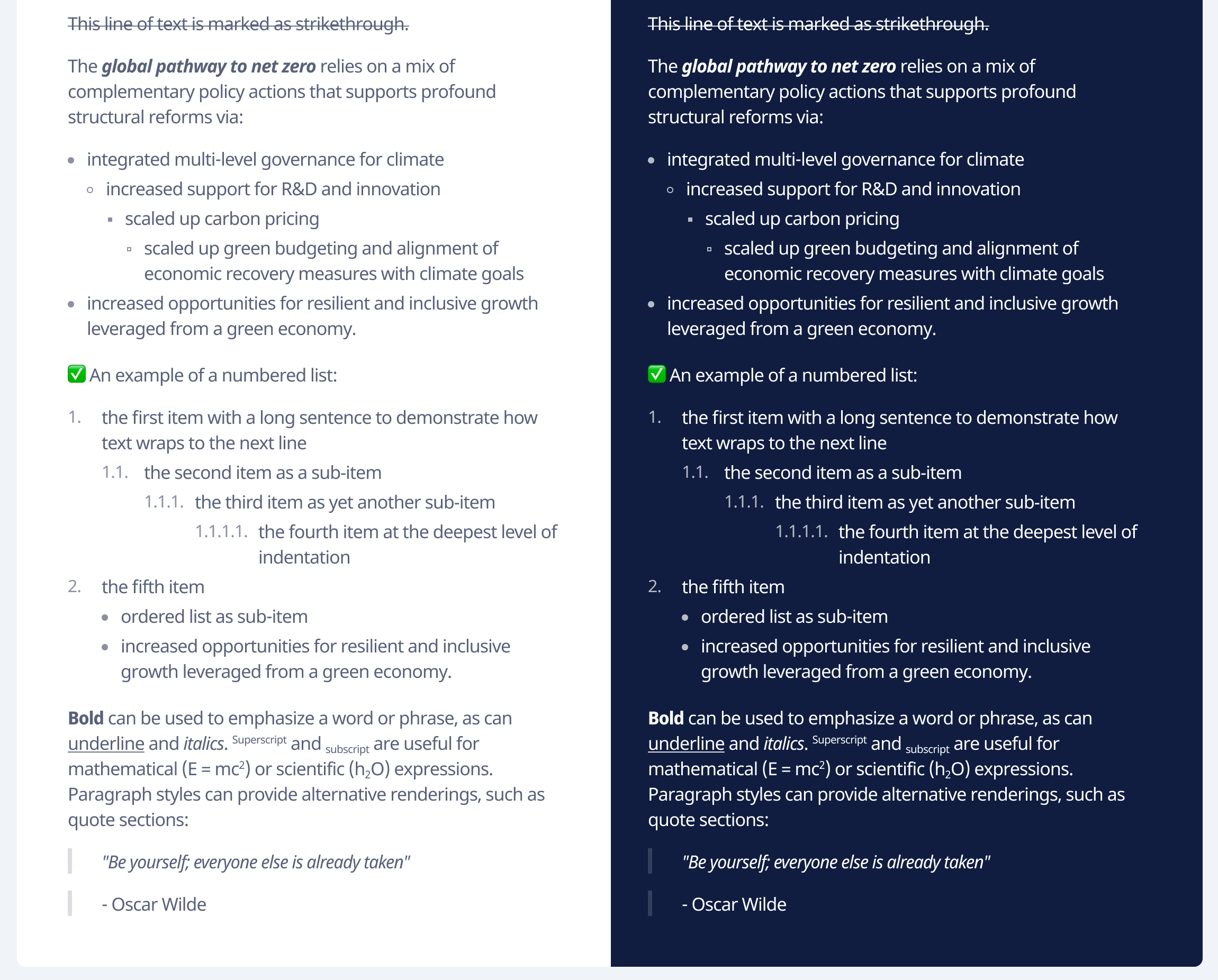
Designers, analysts and developers should use the same language to describe the elements of the interface. These can include colors, typography, iconography, spacing, but also the naming of components and templates. Not finding a common language creates compounding difficulty and confusion down the road.

Accessibility
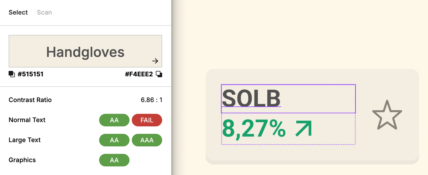
Web Content Accessibility Guidelines (WCAG) compliance is becoming a standard for more and more websites. Having to patch in accessibility after the launch of a product is always a costly operation. Digital products should include accessibility in their design: sufficient color contrast, touch targets and content considerations are concepts that are top of mind for a developer but not always for designers.

Edge Cases
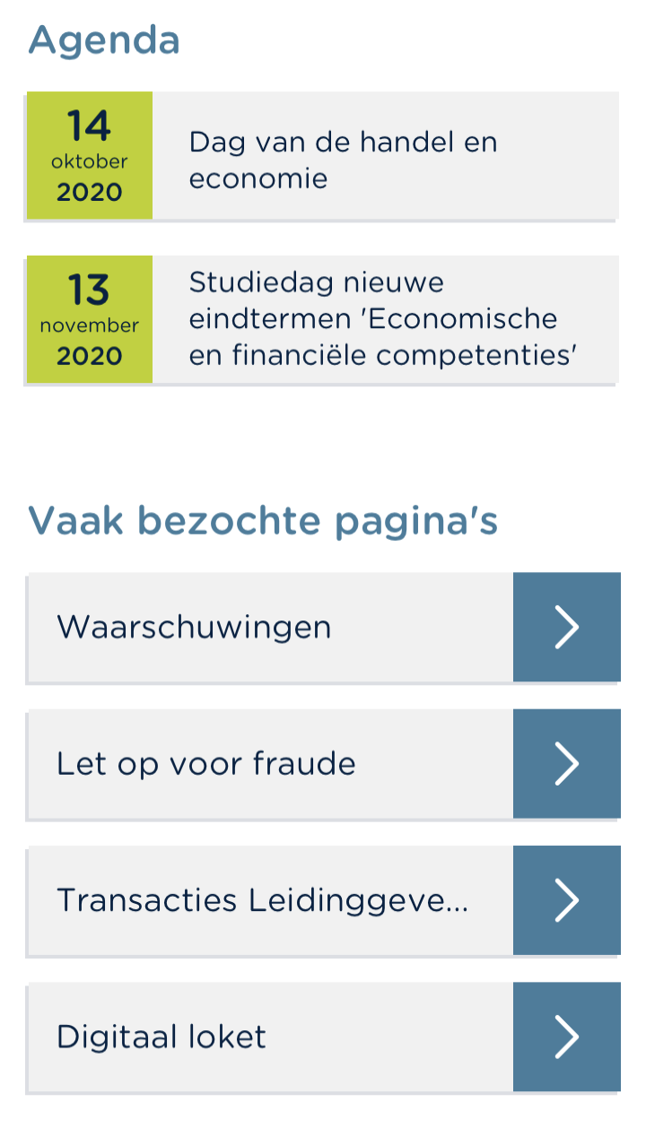
UI mockups usually showcase ideal content because they’re designed to be aesthetically pleasing or placeholder content (e.g. ‘lorem ipsum’). Real products’ content is not always so pretty. UI developers have tons of experience with responsiveness, handling multiple languages and supporting many devices. Stress-testing the designs helps to make them more robust and keep expectations in check.

Technology mapping
Tight collaboration between designers and developers facilitates the mapping of the designed components to ‘live’ components developed in e.g. the website front-end.

Conclusion
In conclusion, the journey from idea to final product in digital product development is complex and filled with challenges. Today’s digital interfaces are created by teams that typically include designers, as well as people with functional and technical roles. Ideally these different profiles work together in a multidisciplinary team from start to finish of a project, but that’s not always the case. Each of the scenarios outlined above represents a different approach to navigating this process, with their respective strengths and pitfalls. However, the goal remains the same: to create a user interface that is not only visually appealing but also functionally robust and aligned with user needs and business goals.
The Fusion approach, where design and development are integrated from the outset, offers a compelling path forward. By fostering collaboration and understanding between designers and developers from the early stages, teams can anticipate potential issues, innovate more effectively, and ensure a cohesive user experience. This approach demands open communication, shared language, and a mutual respect for each discipline’s expertise.
Moreover, embracing modularity in design and development, prioritizing accessibility, addressing real-world content challenges, and ensuring that designs are testable and adaptable are not just best practices—they are essential for the sustainability and success of digital products.
Ultimately, the key to successful digital product development lies in breaking down the silos between design and development. By adopting a collaborative, iterative, and user-centered approach, teams can build products that truly meet the needs of their users and stand the test of time. Let’s move beyond the traditional boundaries and work together to create digital experiences that are not only innovative but also inclusive, accessible, and deeply resonate with users around the world.