The visual identity crisis: why your brand's visual identity might be failing you
Design systems
Design


Nico Vandenhove
Frontend Architect
In today’s digital landscape, achieving visual consistency across various touchpoints is more critical than ever. Many companies invest time and resources into creating a style guide or even a design system, only to find themselves stuck implementing this across channels in an efficient and scalable way. If you're facing challenges in bringing your design vision to life, you’re not alone.
The problem: design chaos and its impact on business
When it comes to managing a visual identity, a poorly governed visual identity can lead to chaos. Here are some of the common issues companies face:
- Slow implementation: The introduction of new components or making adjustments to existing ones can take ages to push through the design and development process
- Inconsistency across touchpoints: Multiple platforms may be out of sync with the current state of your style guide or design system, leading to a fragmented user experience
- Partial implementations: Different teams may only partially adopt the visual identity, resulting in increased maintenance burdens for product teams
These problems not only hinder productivity but also jeopardize the integrity of your brand's visual identity.
The solution: a well-governed design system
Managing a visual identity involves much more than just creating a style guide document. It's essential to have a robust framework that ensures effective governance and implementation of your digital brand identity.
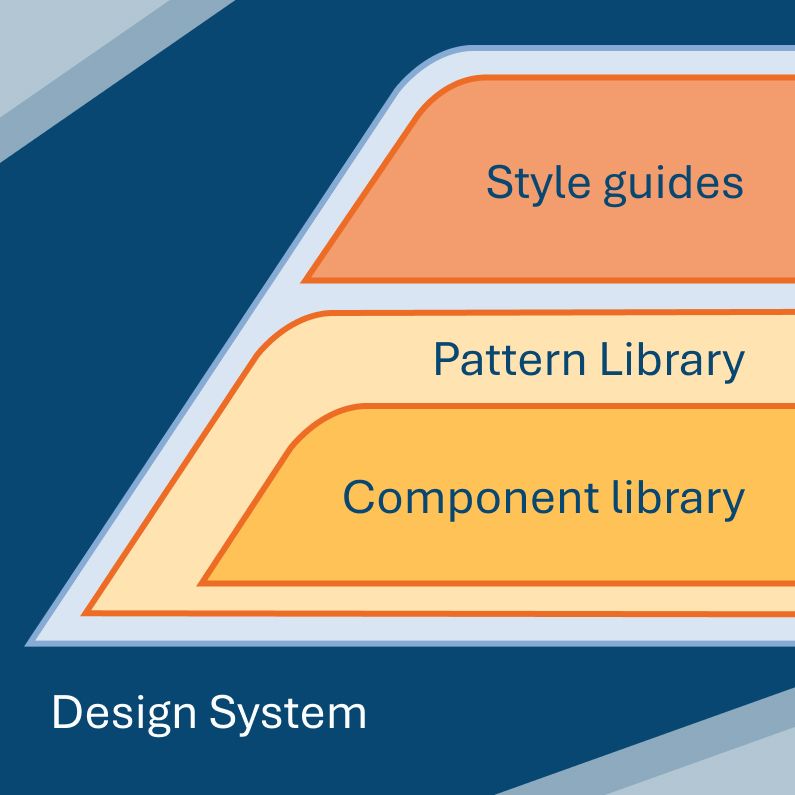
Understanding the difference: style guide vs. design system
It's essential to clarify the distinction between a style guide and a design system. While these terms are often used interchangeably, they refer to different concepts:
- Style guide: Primarily focuses on the visual representation and branding of a product
- Design system: A holistic approach that integrates design and development practices, ensuring a consistent and efficient user experience across multiple products and sub-brands
Think of a style guide as an artifact of your design system. For example, within your design system, you could have a style guide for both light and dark themes.
Building a strong foundation
To govern your brand's visual identity effectively, start by defining the guiding principles of your design system. These guiding principles will guide your UI decision making and wil impact the shape of the components and patterns within your system later on.
When these are clear you are ready to establishing the smallest building blocks, known as design tokens. These tokens, defined by global standards from the W3C Design Tokens Working Group, are platform-agnostic and serve as the foundation for your design system.
During this phase, you will decide on various elements, including:
- Allowed color palette
- Typography levels
- Icon libraries
- And much more
Governance and implementation
Once your foundation is set, you might want to delegate channel-specific implementation work to product teams to create homogeneous user interfaces. However, this is where many organizations struggle.
Product teams prioritize delivery of business features over strict implementation of design system components. What’s “good enough” for one team might fall short for another. Later changes only complicate things—who is responsible then? The team that introduced the component, or the one that modified it?
To eliminate confusion and uphold a higher quality standard for design system components, initial governance of the implementation should be managed by a central team. This team is tasked with developing a shared component library that your product teams can utilize. The library can include web components or cater to multiple channels, depending on your specific requirements.

Following the component library, a pattern library should be developed. This higher-level library dictates how the smallest components should be combined to create user functionality and such should guarantee a consistent experience for your end user over different touchpoints.
Evolving governance
As your design system matures, you may find that a full-time task force is no longer necessary. At this point, you can consider transitioning to a federated or community-based approach. However, even in this scenario, it's advisable to keep a small central governing body for the design system. This small team of decision-makers can validate and triage contributions from the product teams.

By implementing this strategy, you can significantly enhance the governance of your digital identity and reduce the chaos that product teams often face.
Summary: key takeaways
- A design system is more than just a style guide
- Clear, deliberate structure is needed for consistent implementation
- Design systems should use agnostic language to support multi-platform adoption
- Treat your design system as a living product, as it requires maintenance and care
- Begin with centralized governance, then move to a federated model as your maturity allows
Conclusion
A well-governed design system is essential for maintaining a cohesive visual identity. By understanding the differences between a style guide and a design system, establishing a strong foundation, and implementing effective governance strategies, you can ensure that your brand remains consistent and engaging across your various digital touchpoints.
Struggling to maintain visual consistency at scale? Let’s talk about how a properly governed design system can help.